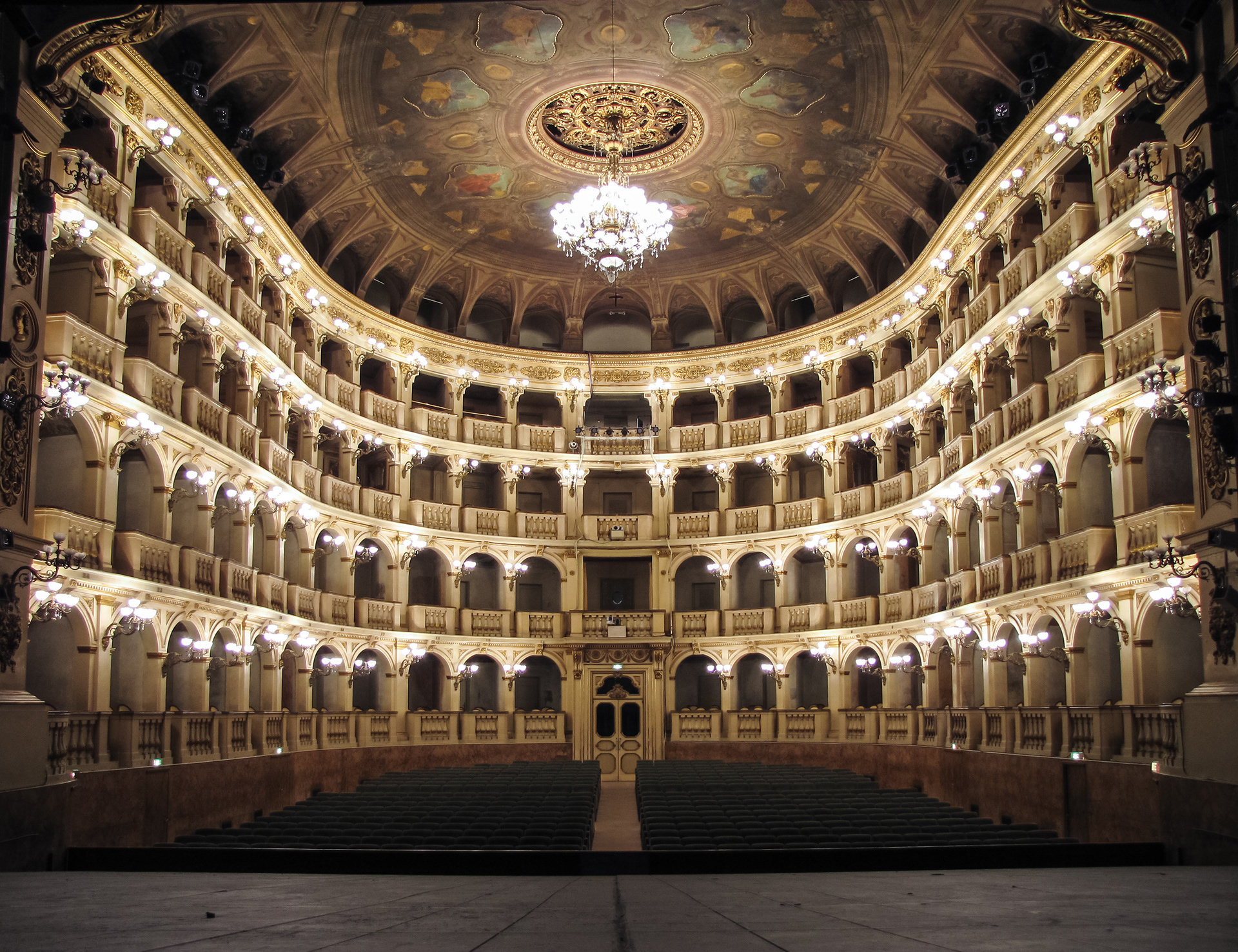
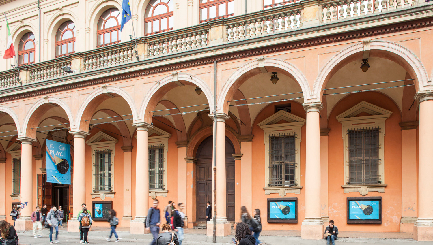
This theatre is one of the most important Opera venues in Italy, opened on 14 May 1763 it was the first major opera house to be constructed with public funds and owned by the municipality. Thanks to its bell-shaped architecture is one of the theaters with the best acoustics in Europe. Many major figures like Arturo Toscanini, Giuseppe Verdi, Gioacchino Rossini, Richard Wagner, Vincenzo Bellini, were associated with the Teatro Comunale since 1894.
CONCEPT
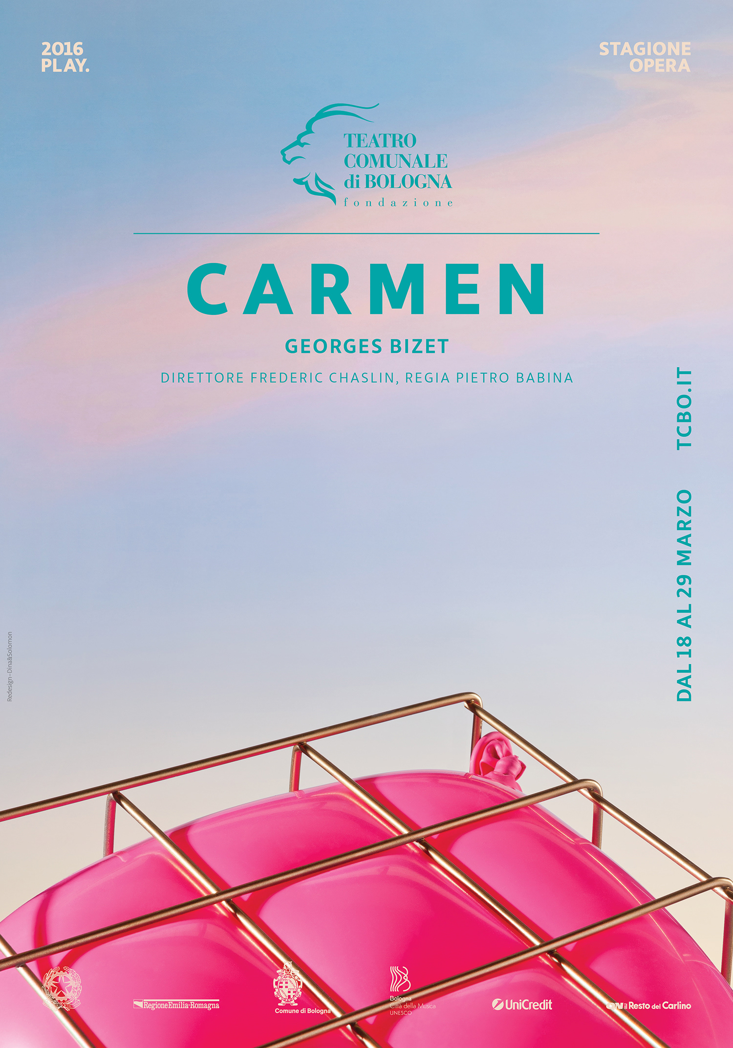
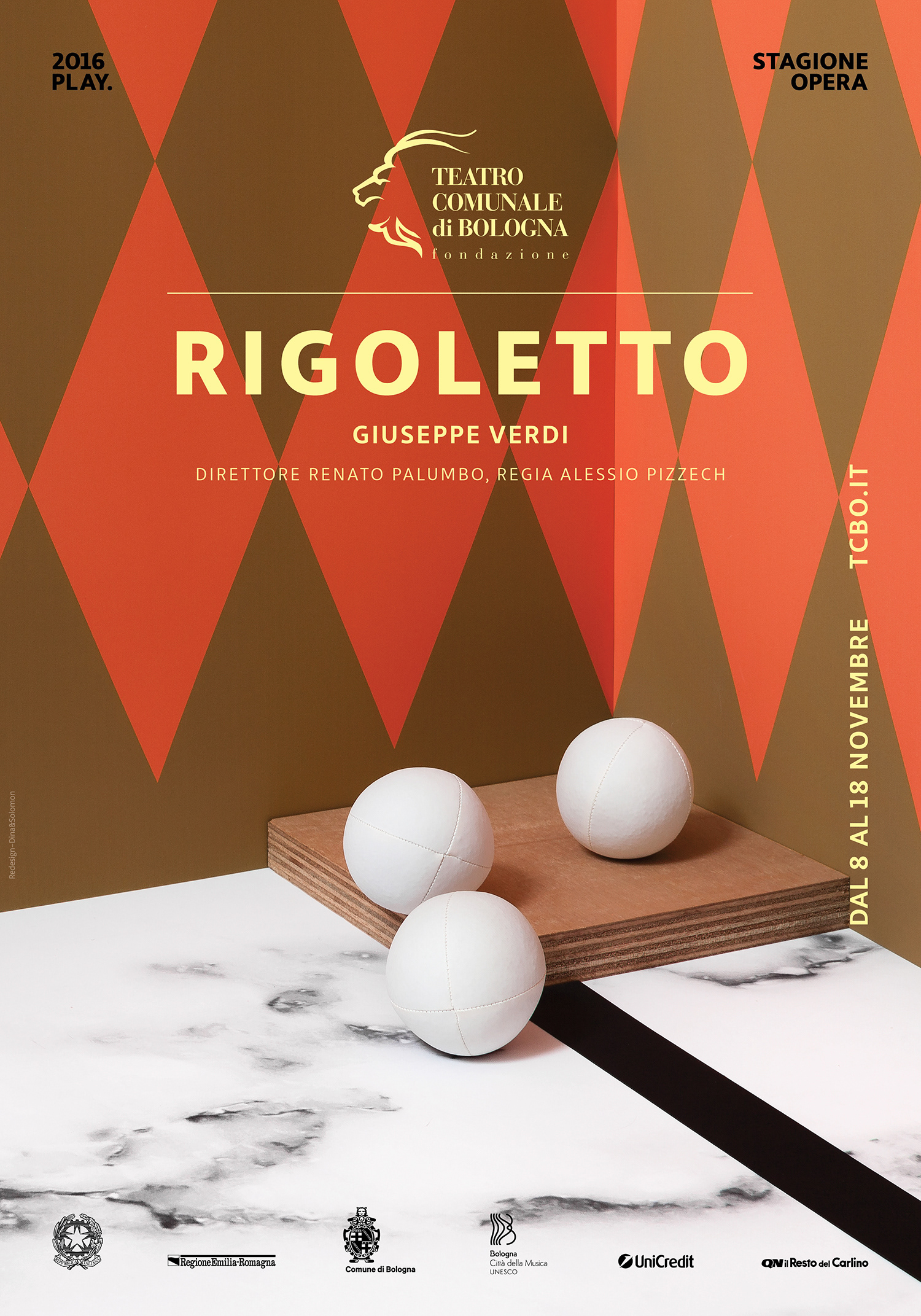
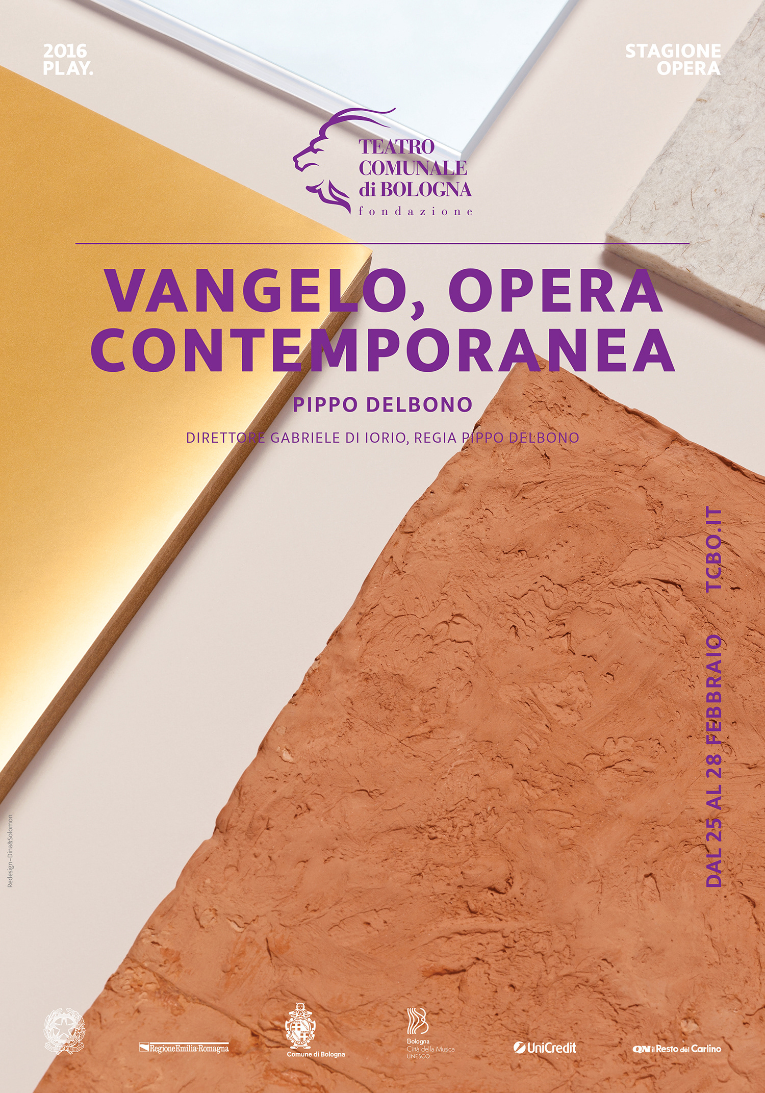
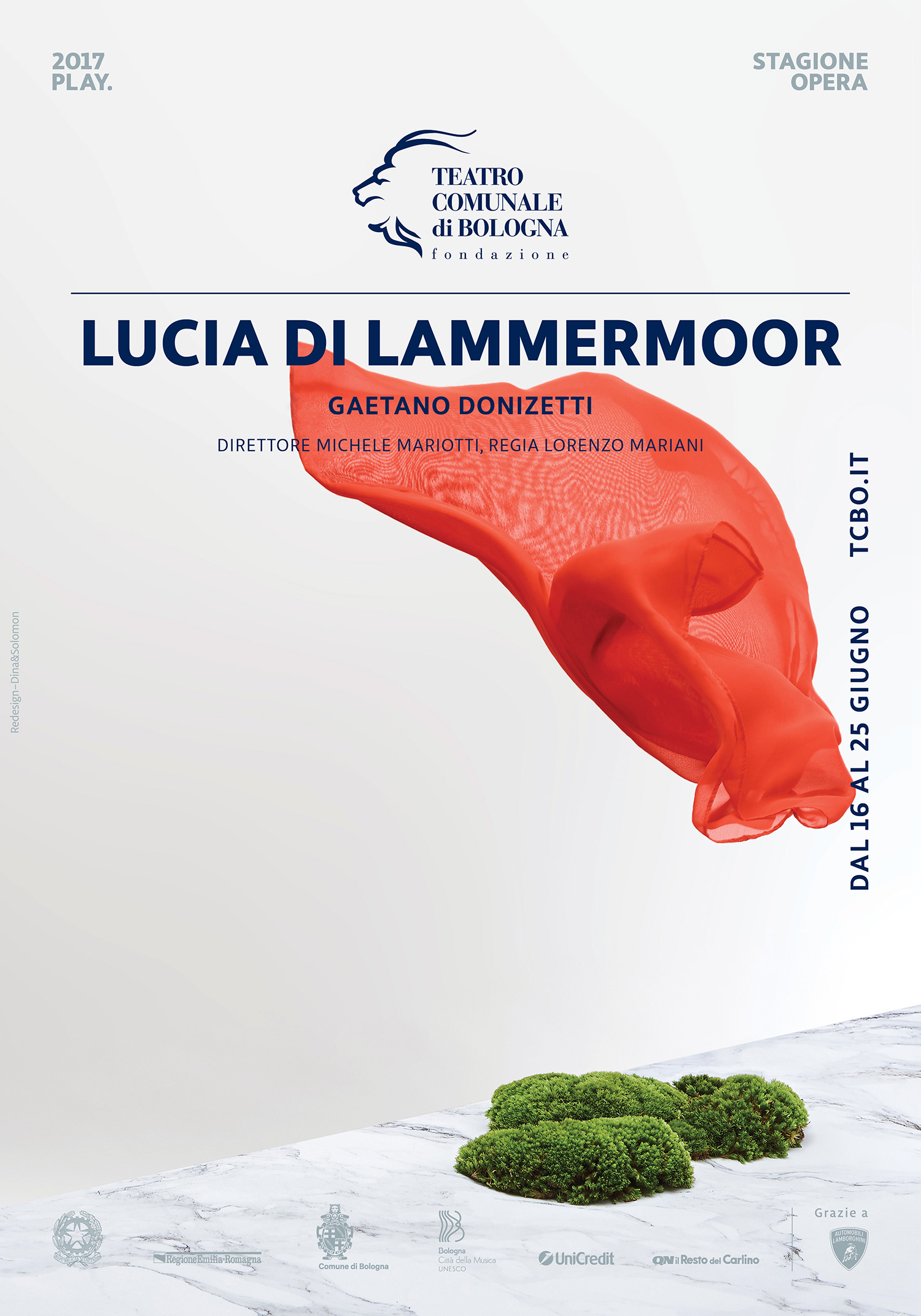
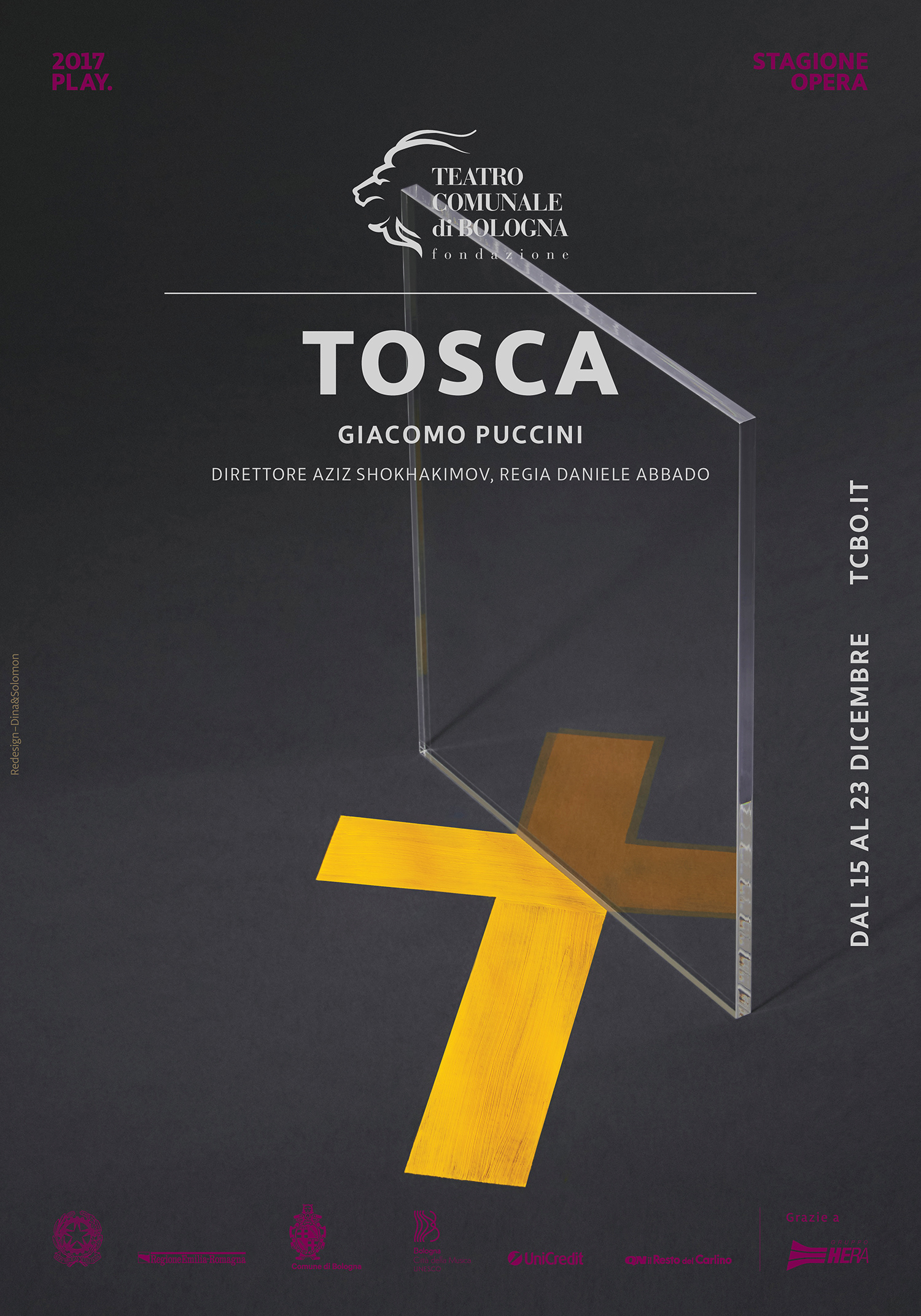
Bologna’s Comunale theatre is a dynamic and open space, content and container, a cross point
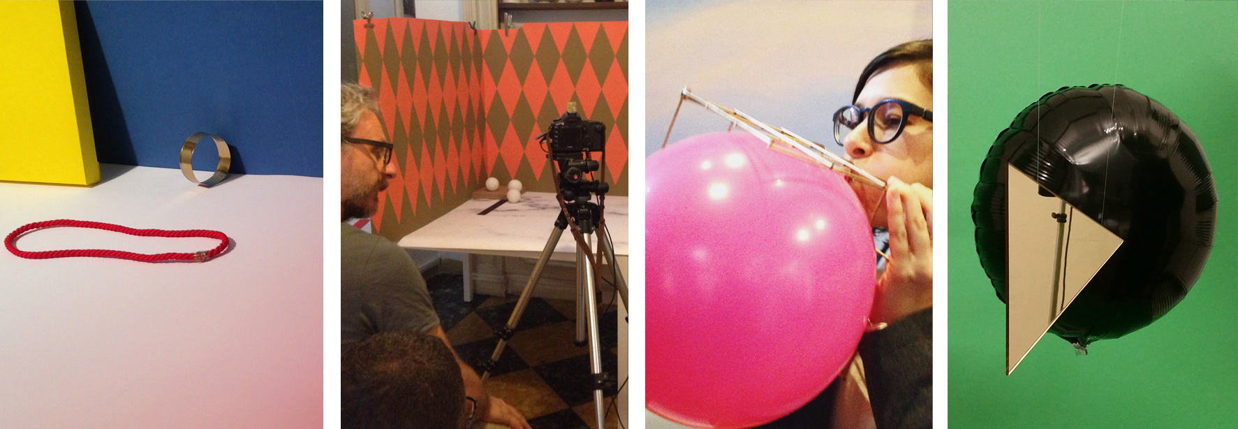
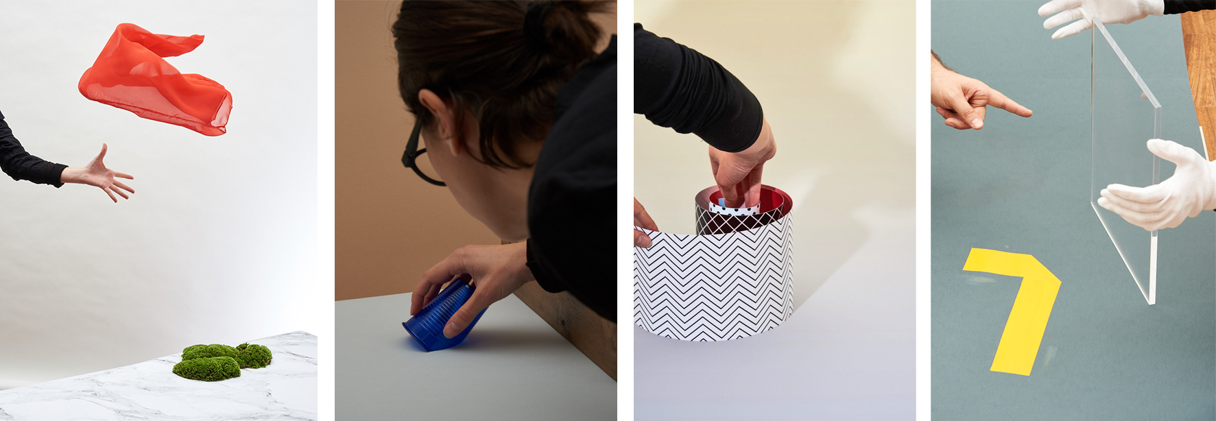
of traditional and contemporary– where senses, art and discipline freely move and being remixed in new ways, creating new horizons. All visuals are little scenes we’ve handmade playing with everyday objects,
graphics and photography linking reality and representation, creating a space where shapes
and materials exchange roles and meanings.
Each Opera visual is an expression of its essence, open for interpretations, inviting viewers
to pour into it their personal experience.
Avoiding the use of classic Opera symbolism and stereotypes, we aimed to dialog with all kind
of publics – elderly theatre members that know well Operas’ plots, history and compositions,
as well as young people that may have never been to the Opera before, but are curious and always
in a search for inspiration.

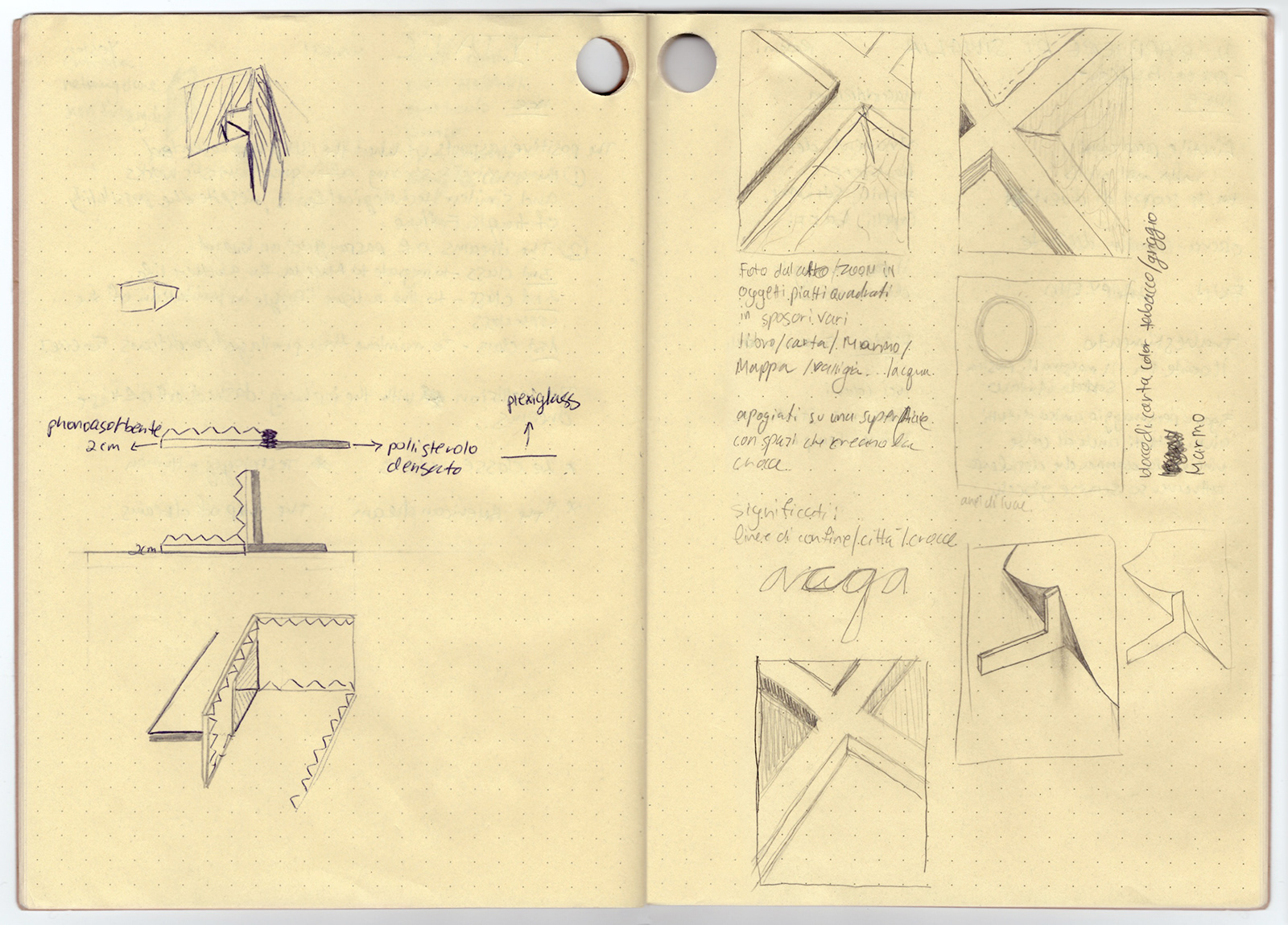
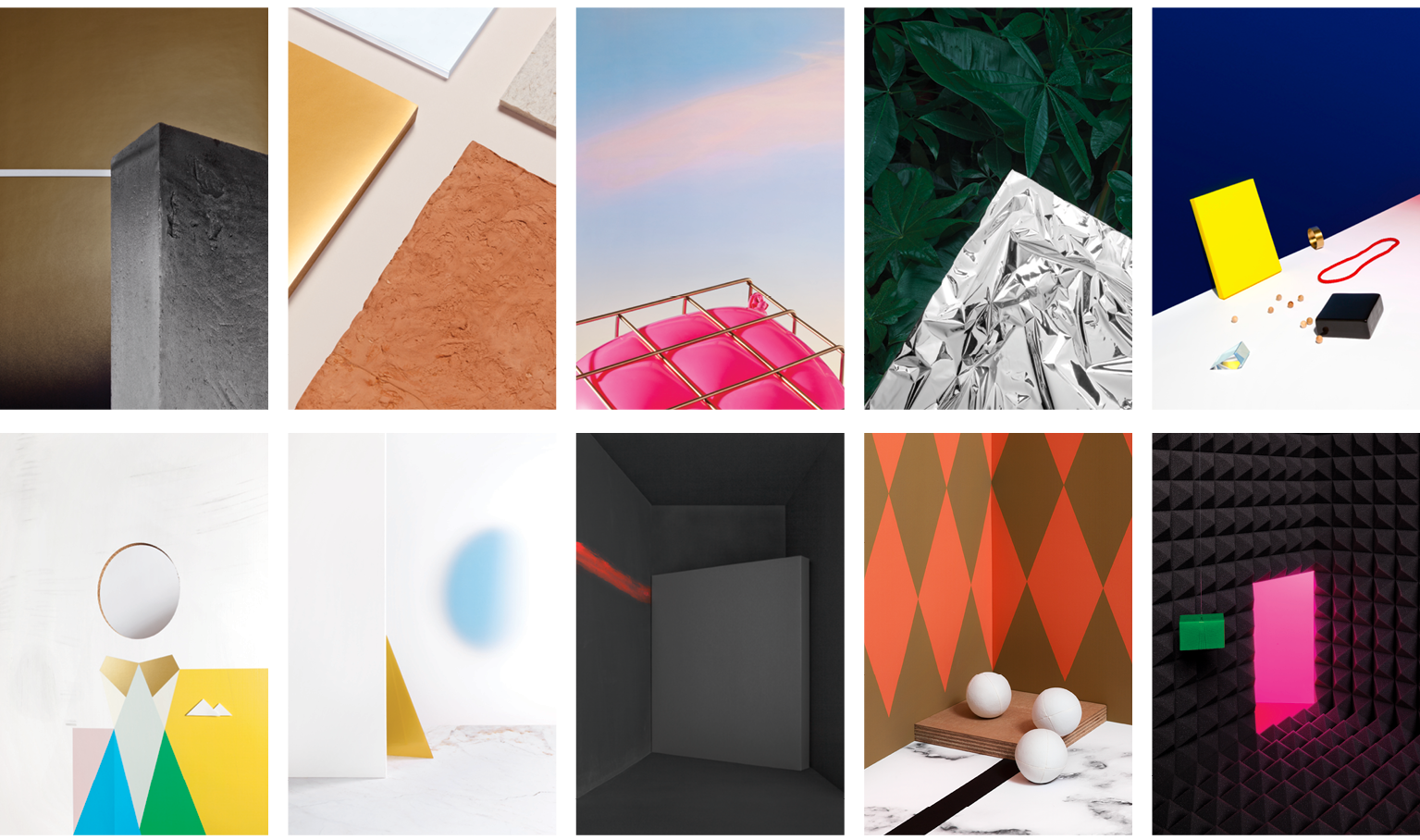
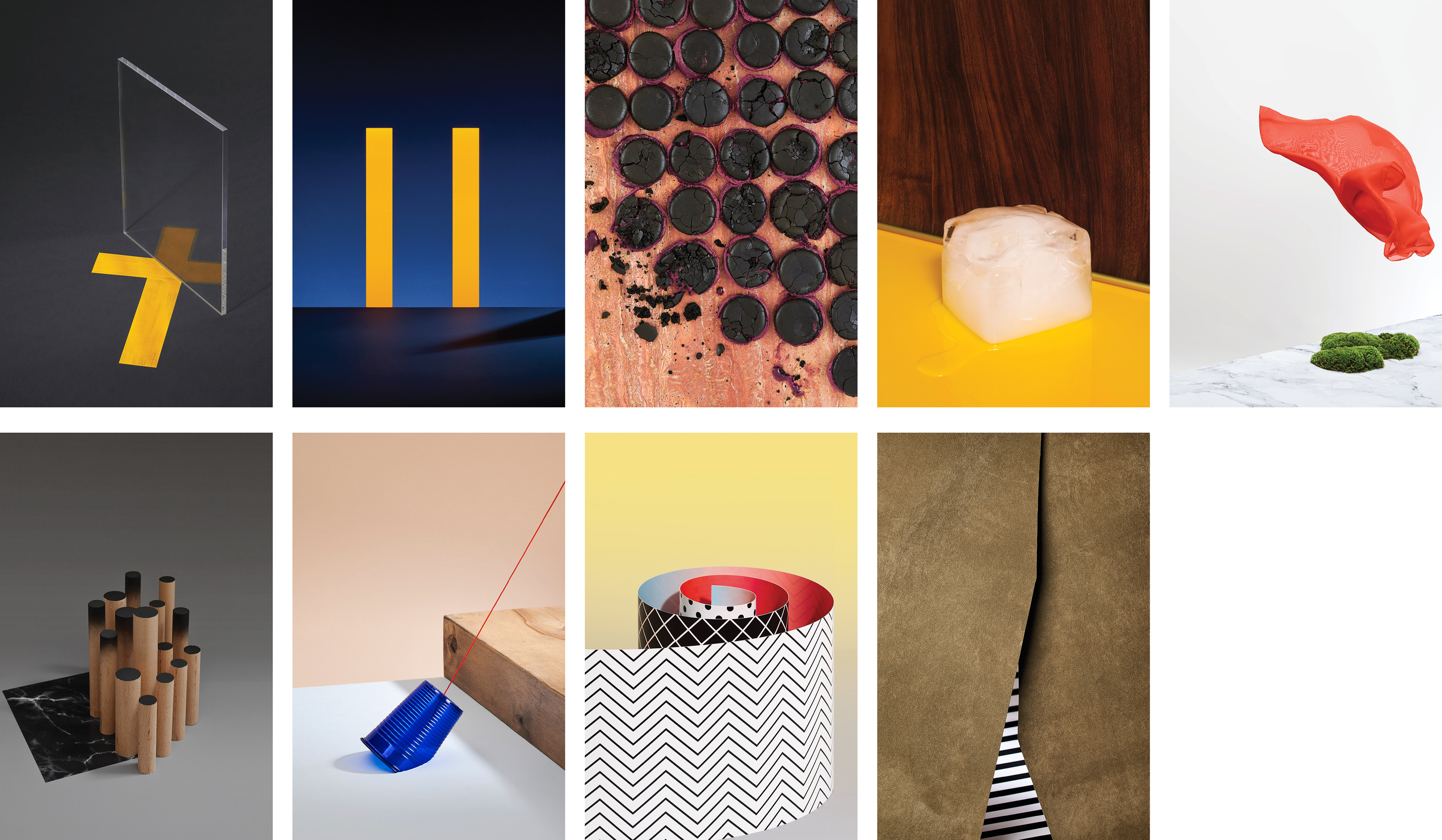
After having hand made and prepared all sets’ elements for each Opera poster,
here we are assembling, styling and shooting.
here we are assembling, styling and shooting.
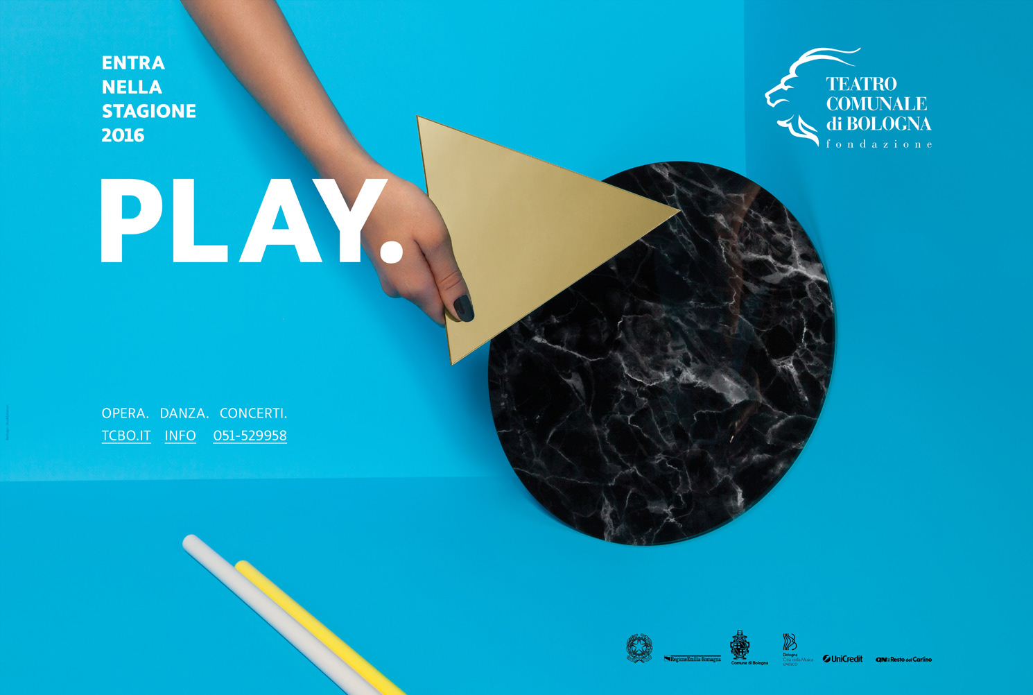
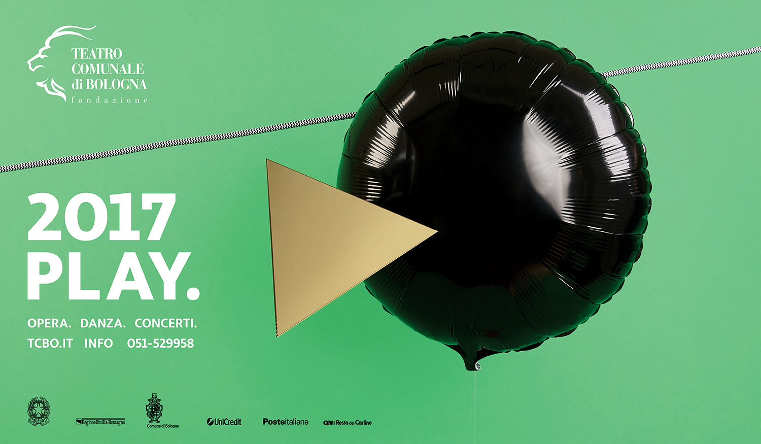
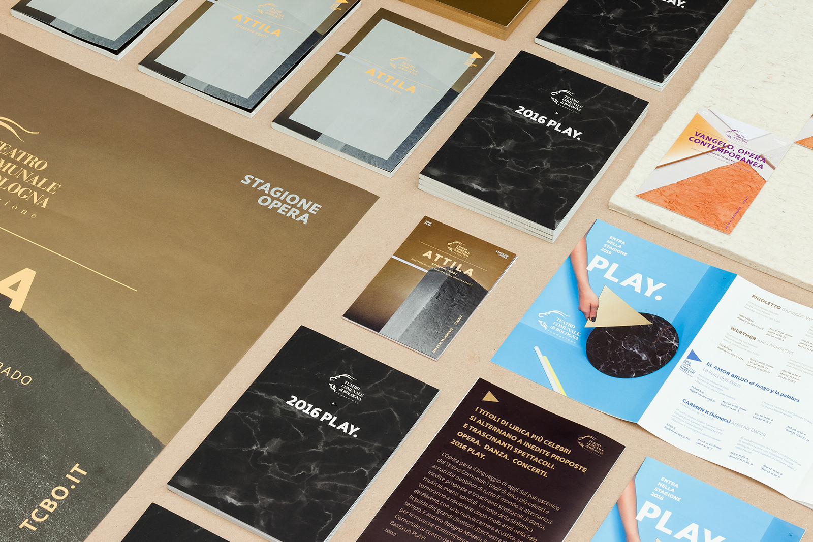
2016-2017 "PLAY" Opera poster series
was made for one of the most important Opera
venues in Italy-Bologna’s Comunale theatre, inaugurated on 14 May 1763.
The posters series is part of a larger project of the whole which also included
the restyling of the historical Logo.
was made for one of the most important Opera
venues in Italy-Bologna’s Comunale theatre, inaugurated on 14 May 1763.
The posters series is part of a larger project of the whole which also included
the restyling of the historical Logo.
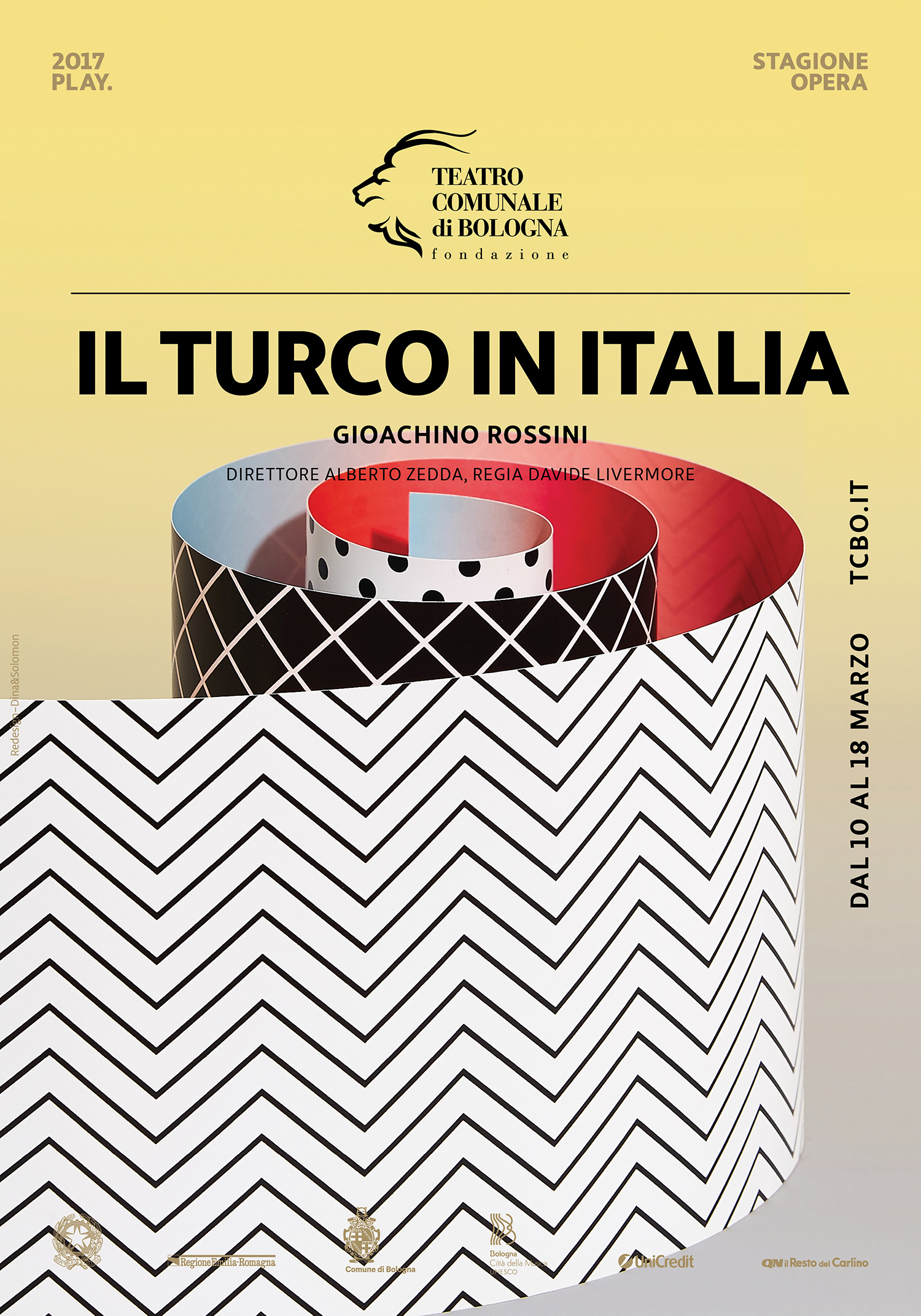
2016 PLAY, title and key visual had introduced the new Opera, concerts and dance season.
A set-up of geometric shapes, organic and synthetic matters interacting in a space, suggesting a wider read
of the digital play icon, inviting people for interaction with Bologna’s Comunale theatre.
A set-up of geometric shapes, organic and synthetic matters interacting in a space, suggesting a wider read
of the digital play icon, inviting people for interaction with Bologna’s Comunale theatre.
PLAY Opera posters 2016
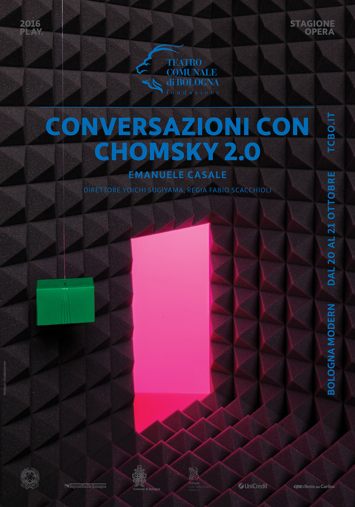
PLAY Opera posters 2017

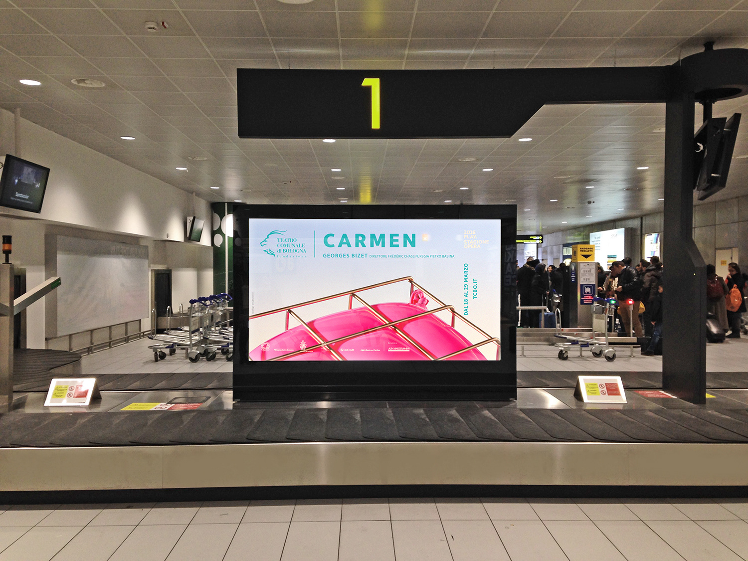
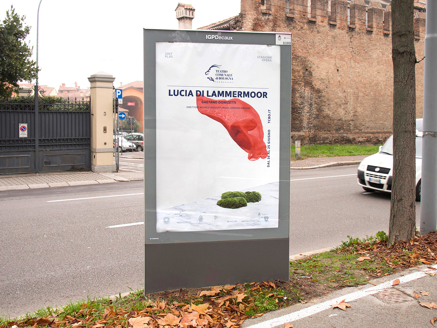
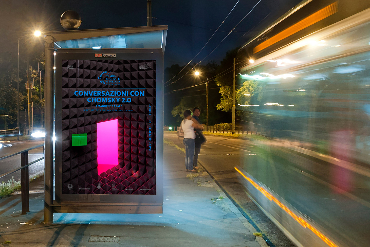
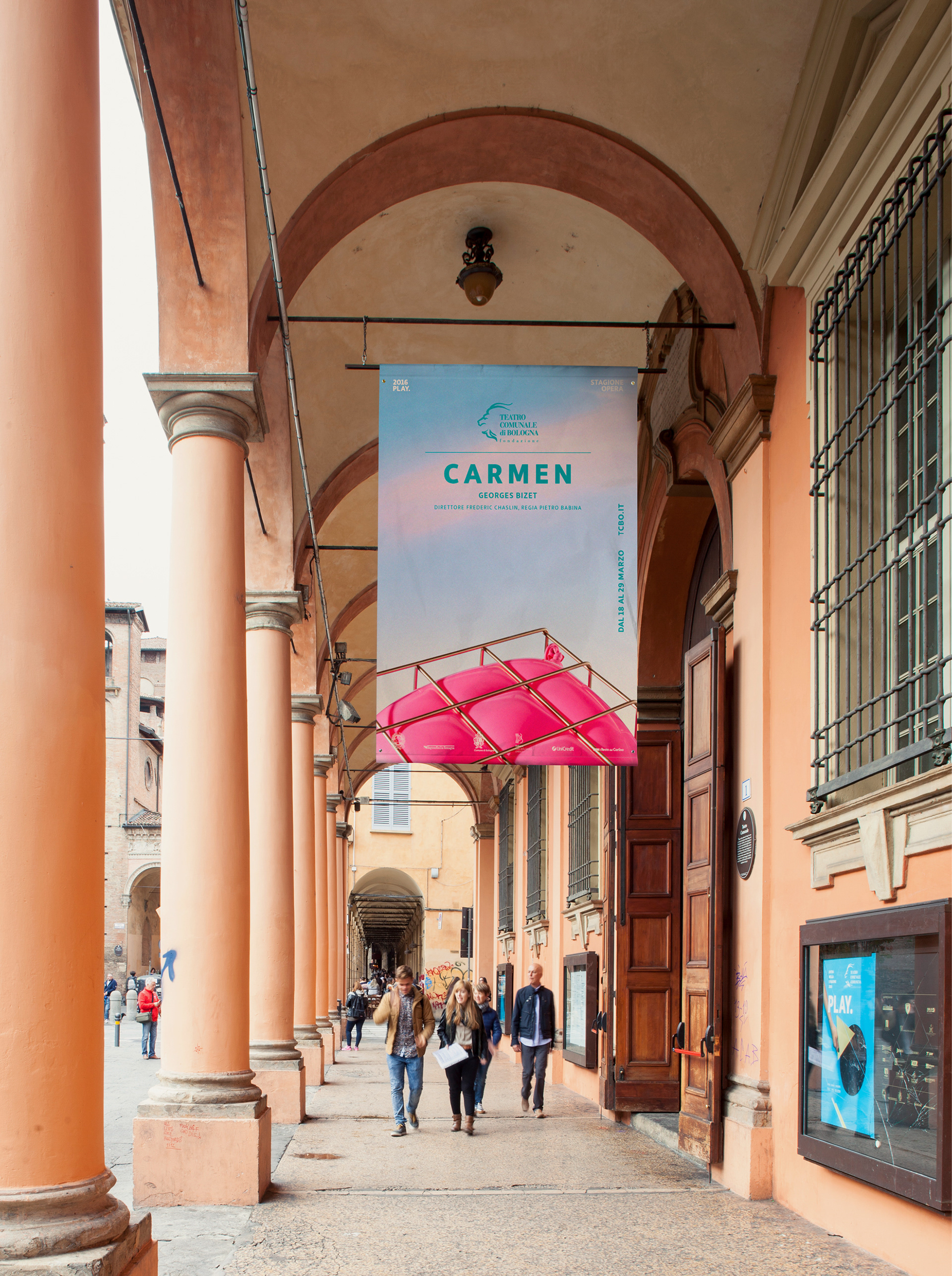
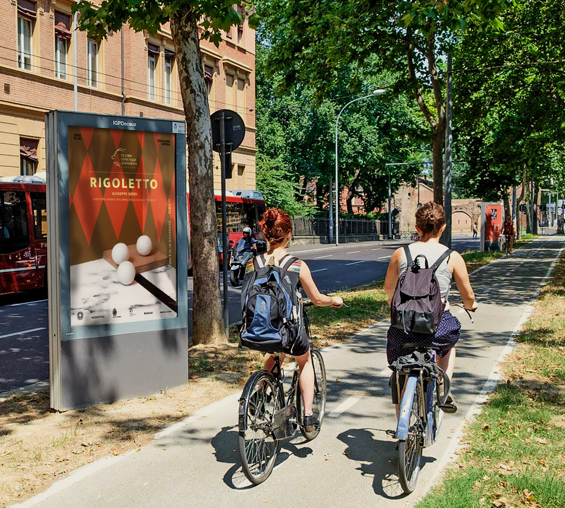
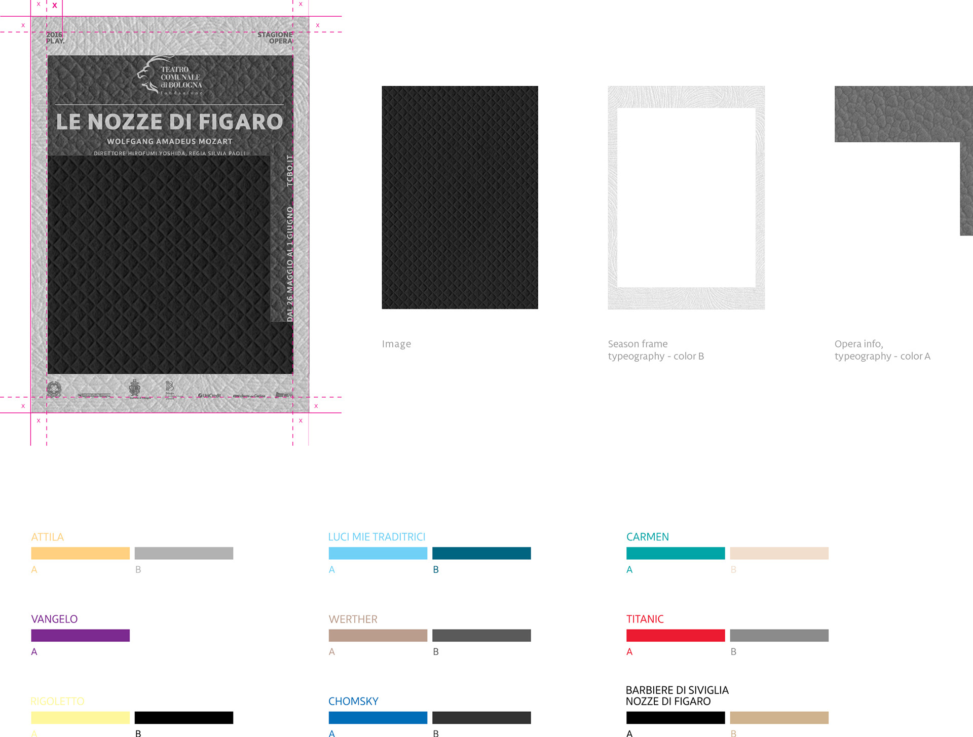
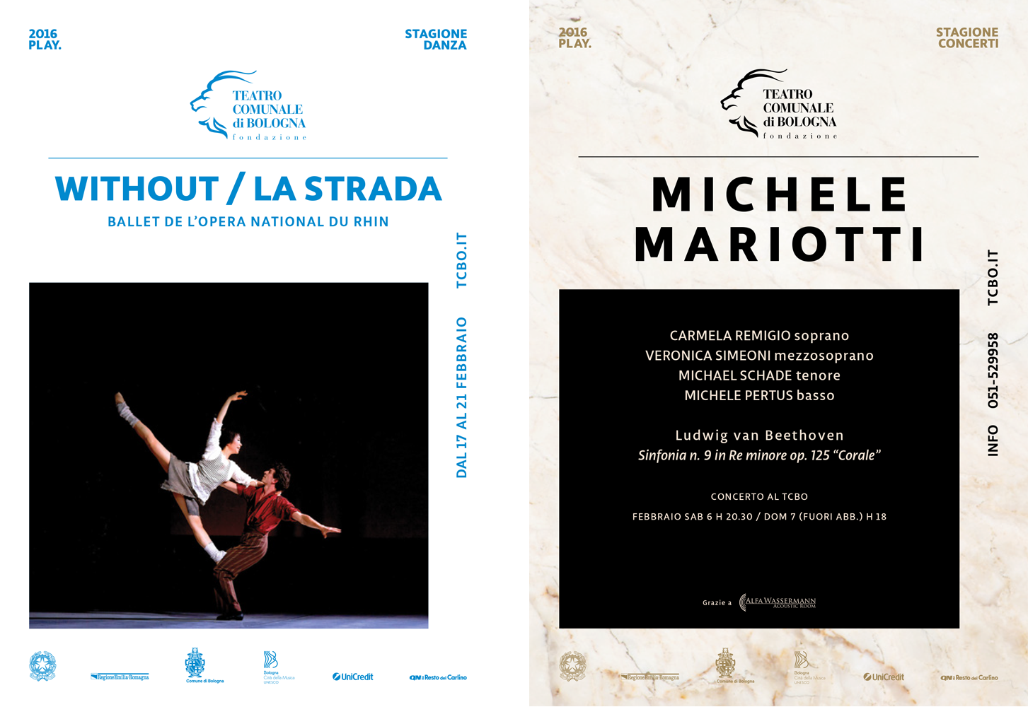
GRAPHIC SYSTEM
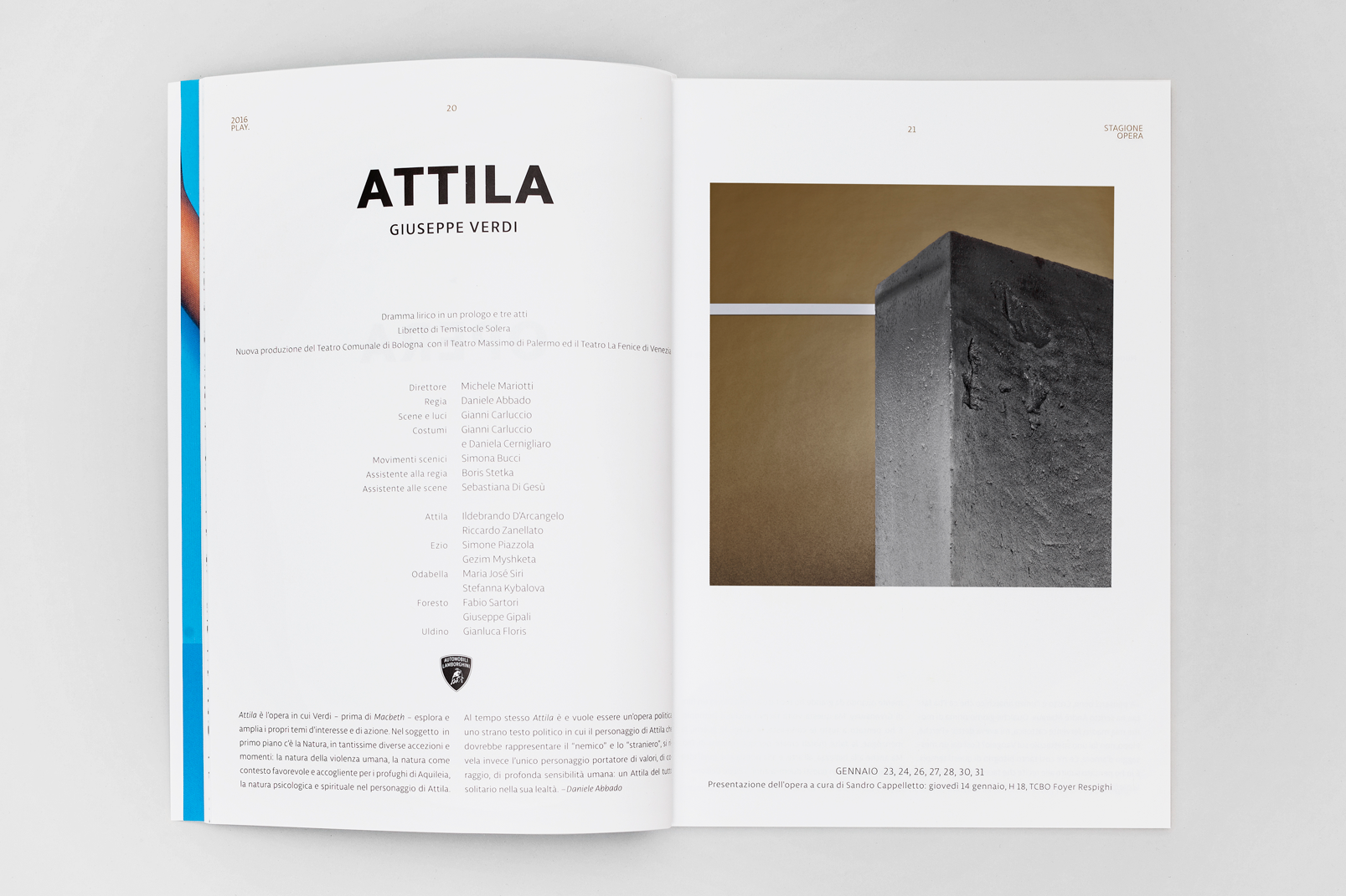
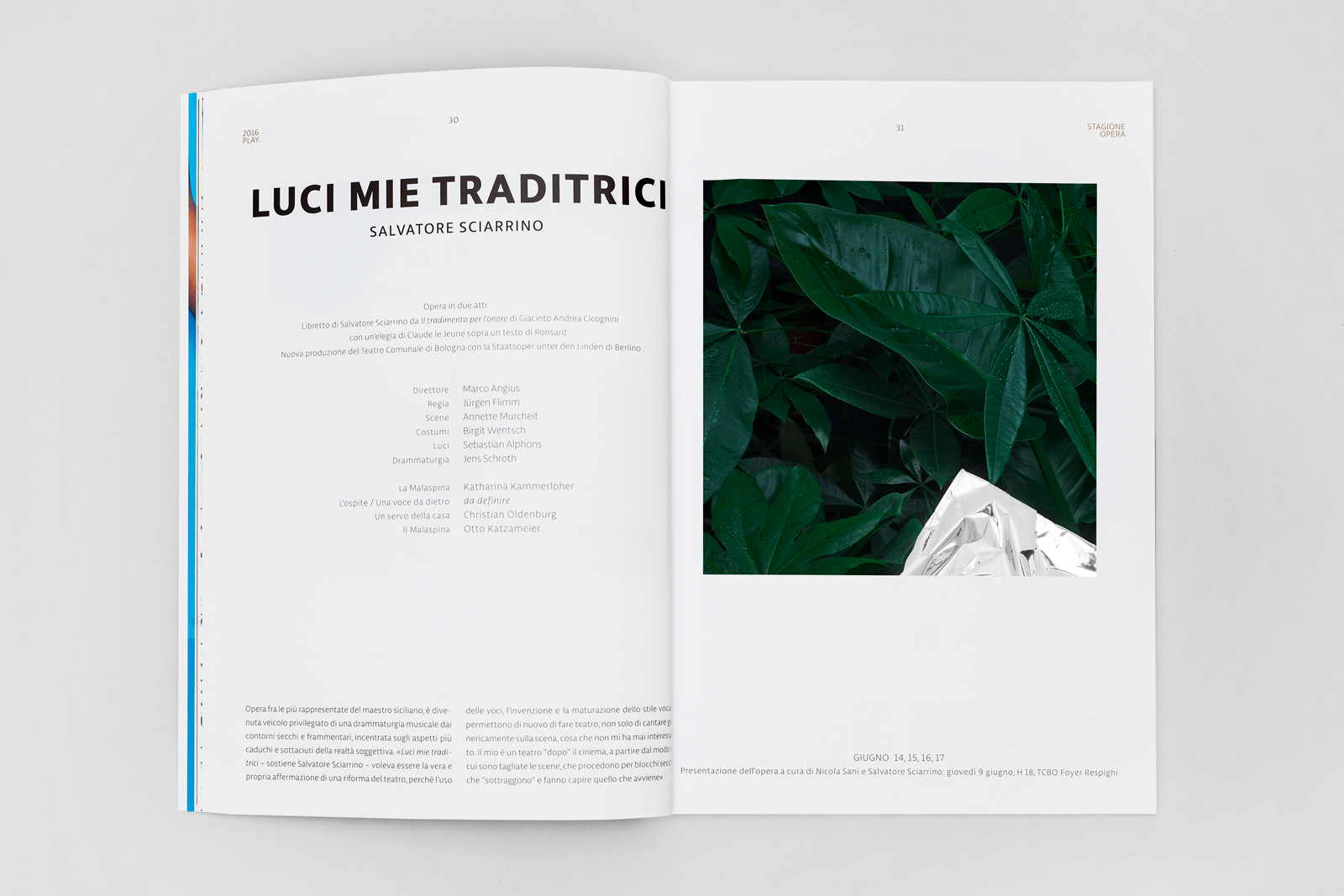
The grid permits a great dynamism for the constantly changing contents, while keeping a strong identity and recognisability of the theatre. The restyled logo (now more elegant and lighter) centred on the top, is watching the scene from his historical point of view. The unusual images are combined with a center–aligned floating typography (Libertad font), changing colours, creating two areas: the season frame and the Opera’s artistic information.
Concerts season / Opera season posters 2016
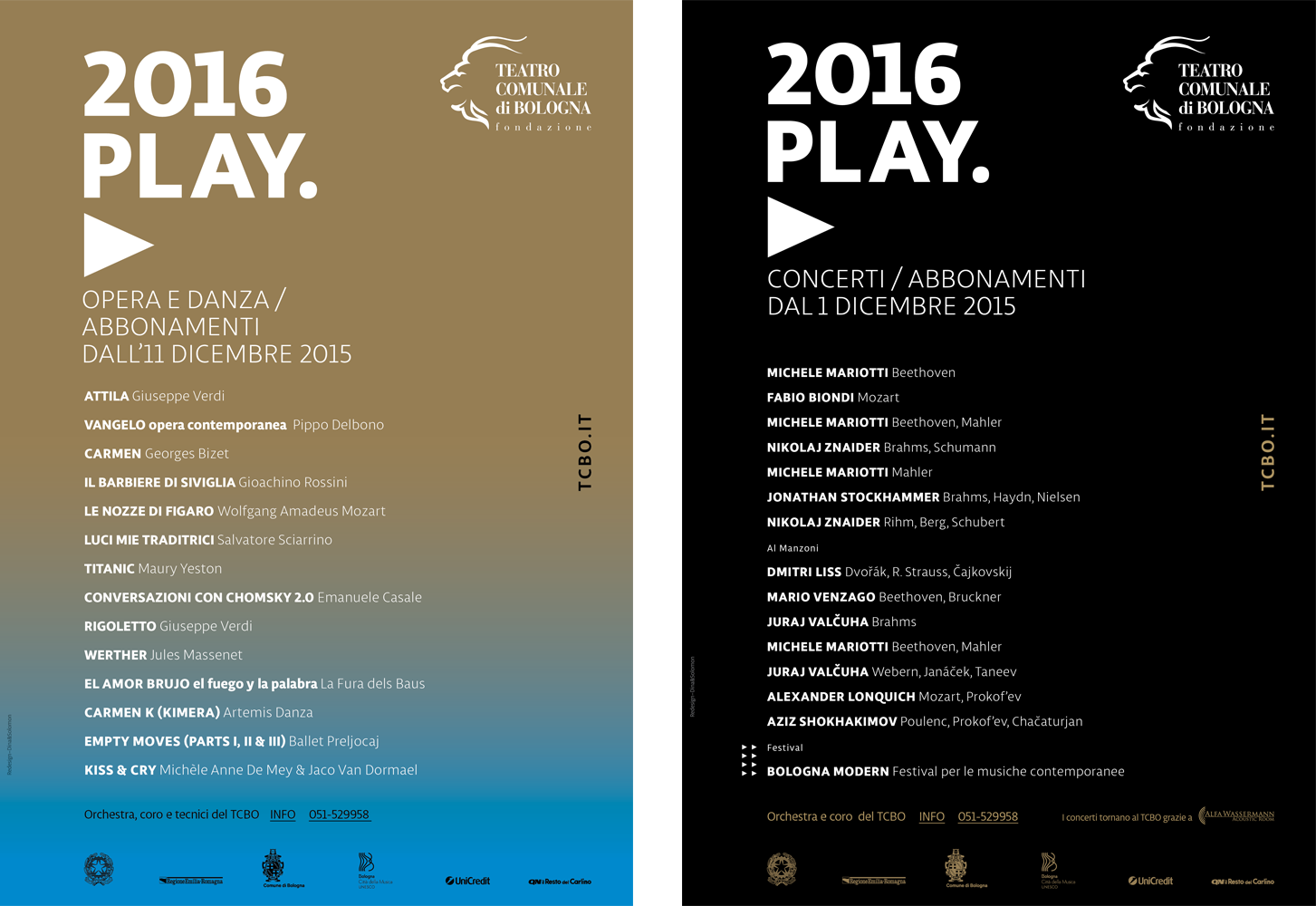
Graphic system (concert / dance) 2016
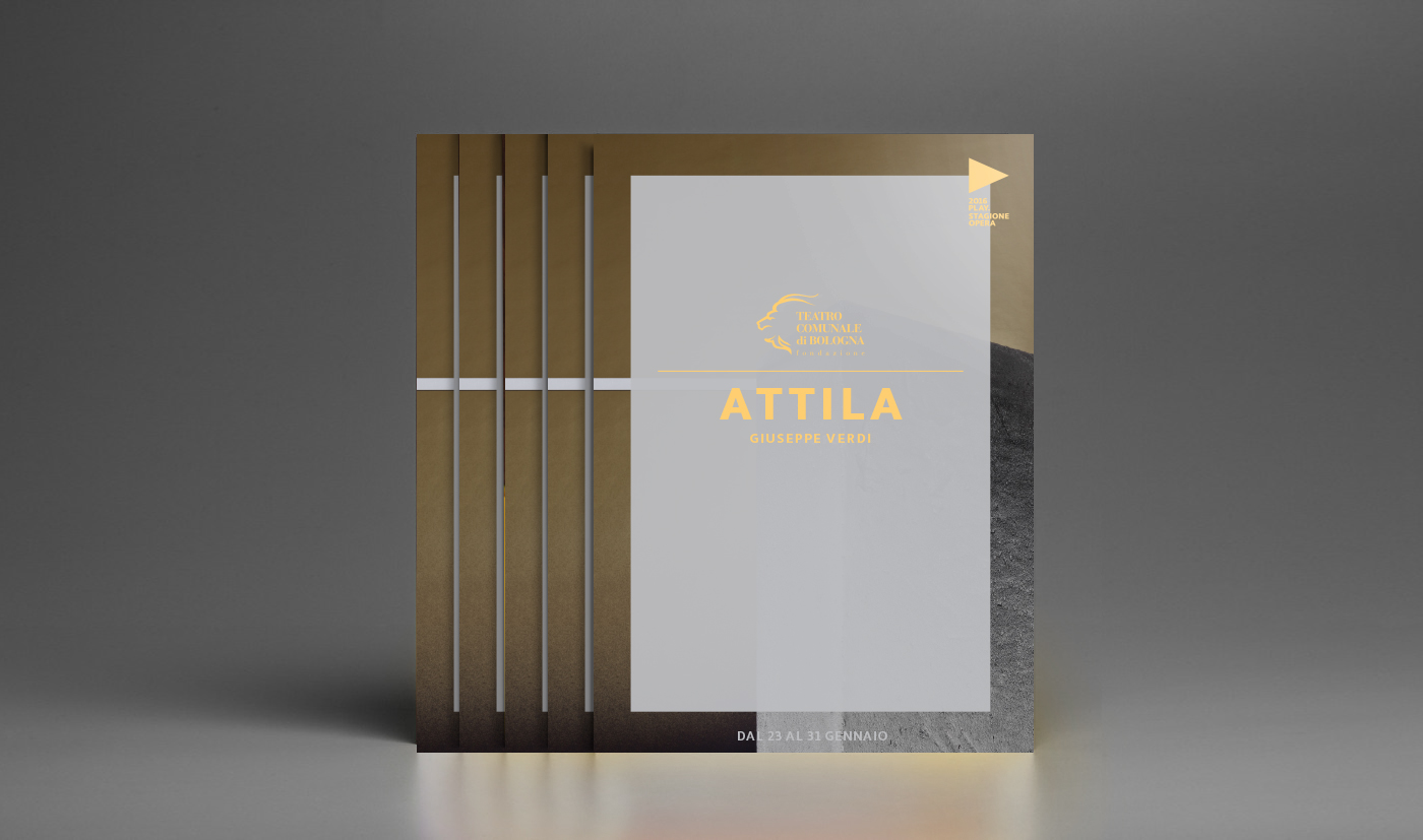
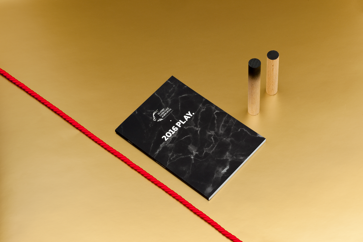
Libretto cover (Opera booklet)