CONCEPT
We had the honor to work on this project started from a really blank page.
Donatella Agostoni inherited the winery from her artist grandfather Paolo Manaresi.
Coming from a family that over the years made, appreciated and collected art, to take on its tradition
and cultural legacy, she decided to call the winery after his name.
Then, the whole design concept was created around the world of art and especially Manaresi’s art of engraving.
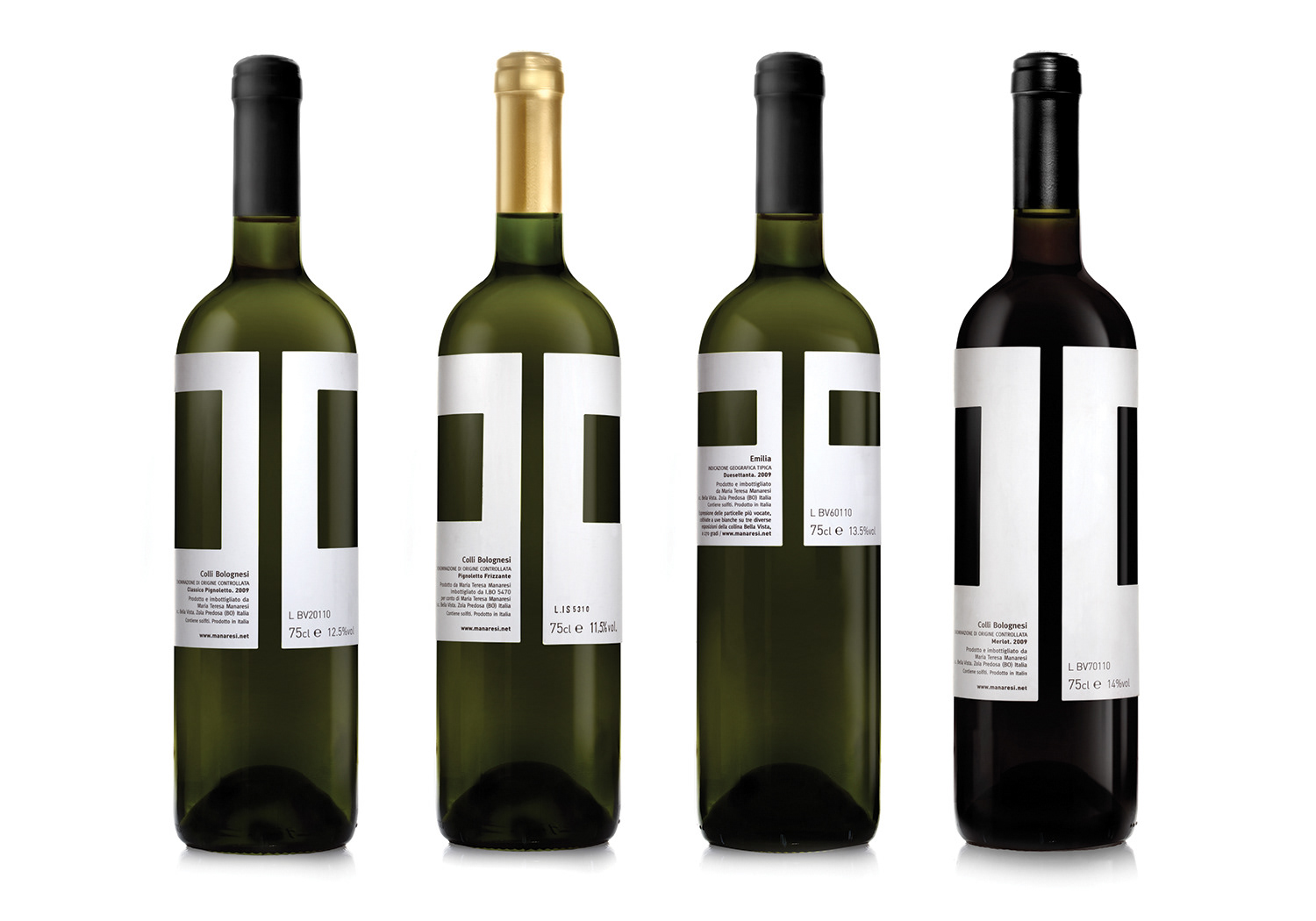
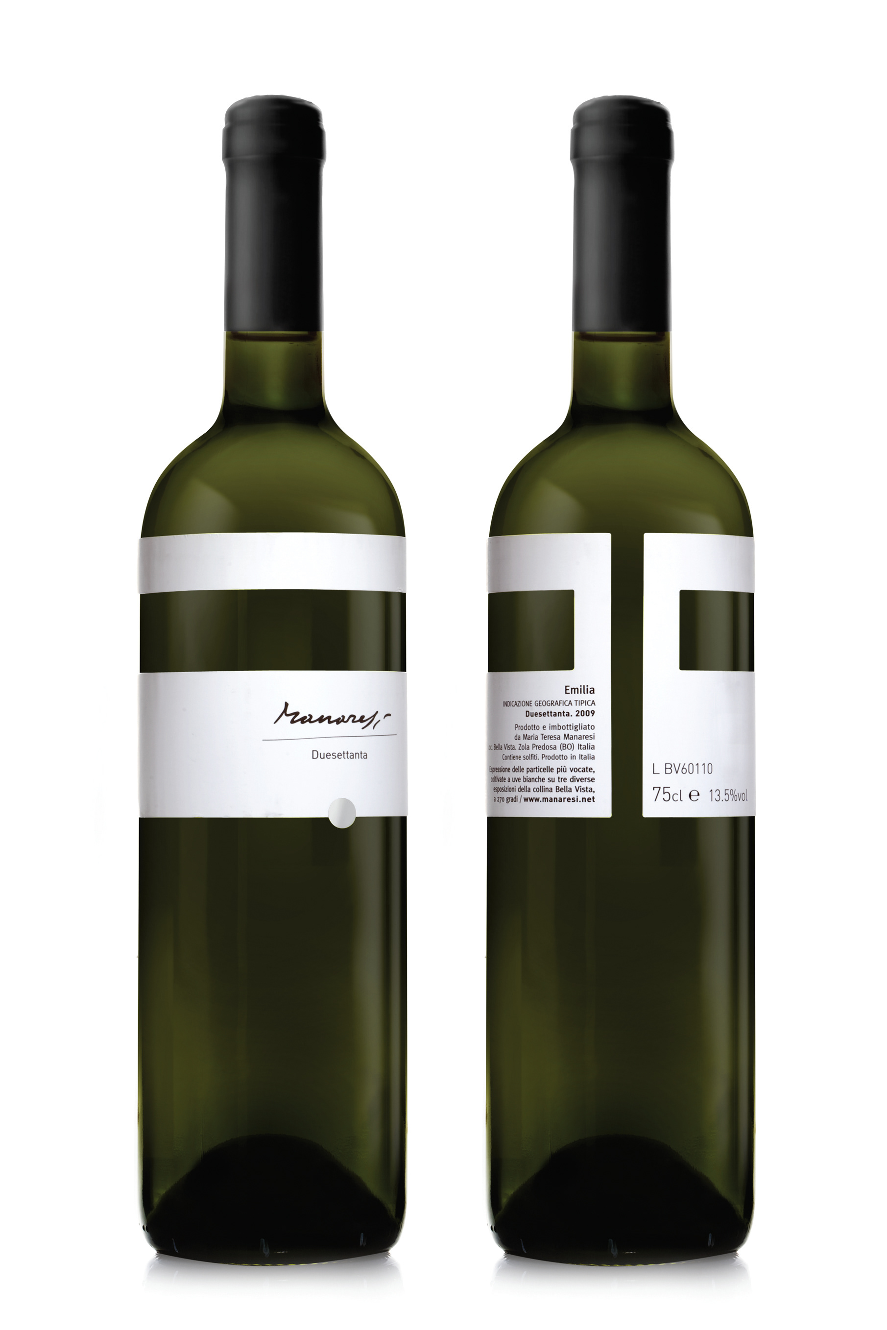
For example, the frame that is created, each time differently, by pressing the piece of aluminum
on a bigger piece of paper.
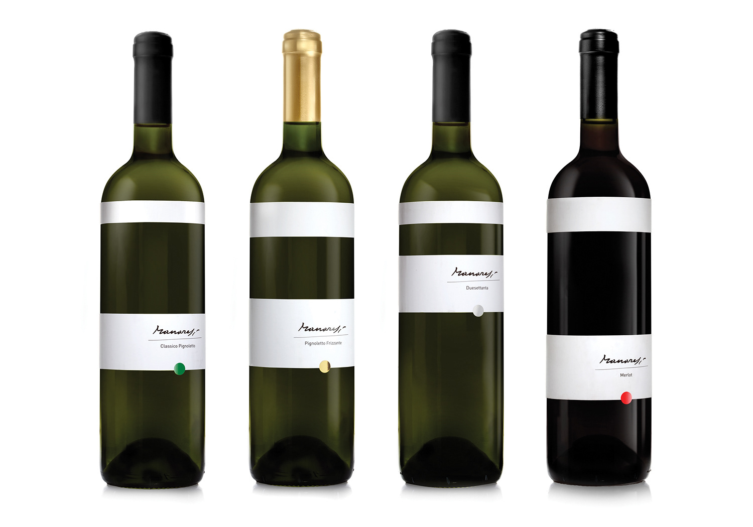
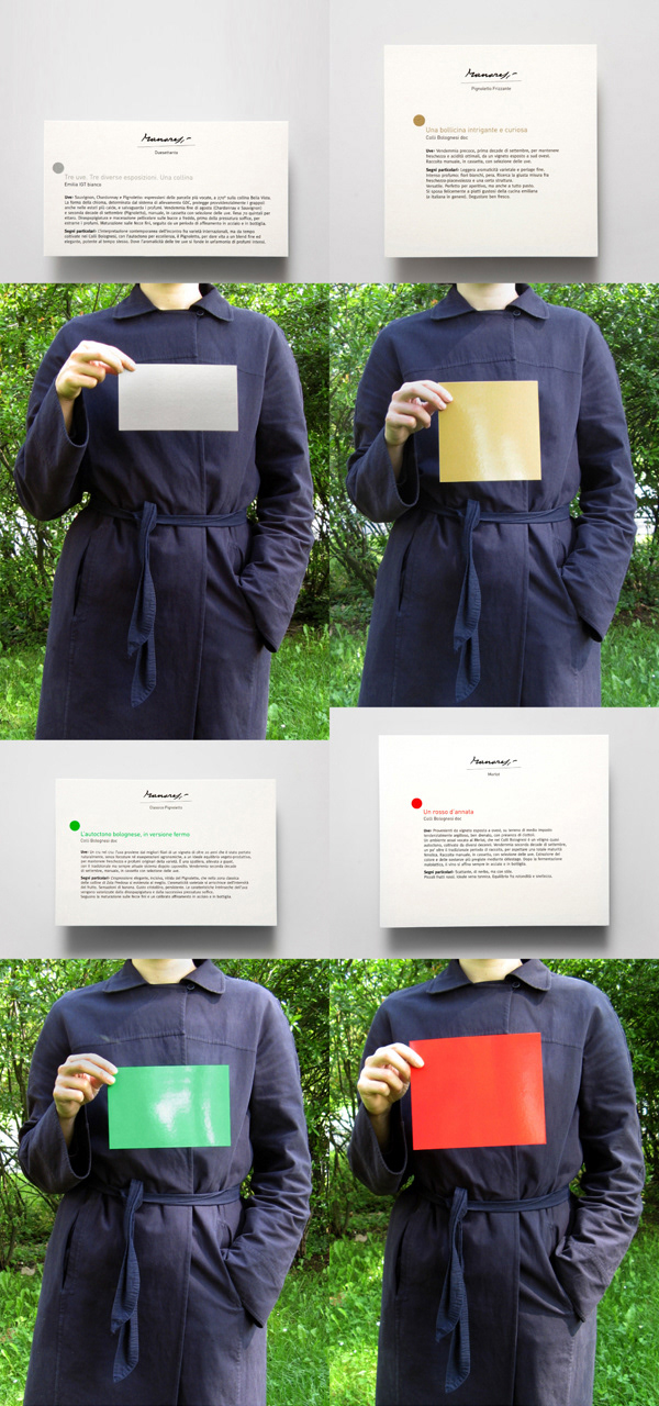
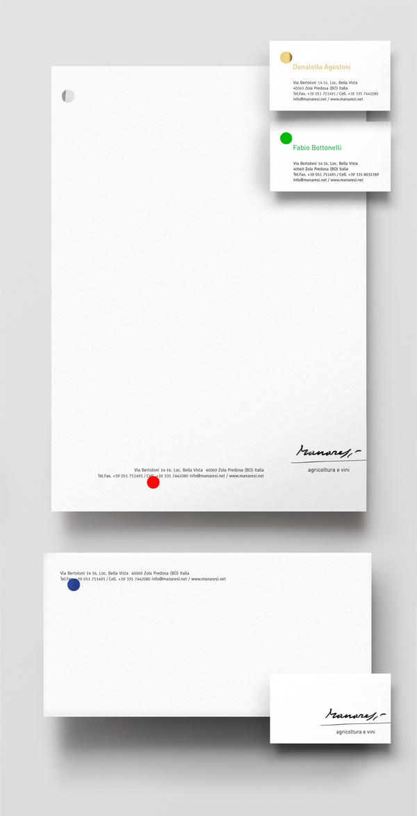
This frame became the leading component of the brand, each time it changes format and the art it contains inside. Another important components are the four decided colors (red, gold, silver, green),
one for each kind of wine.
These sometimes appear as the dot (inspired by the ‘sold’ red dot), other times they come in different
rectangles formats or even in photos (as in the web backgrounds)
We had the honor to work on this project started from a really blank page.
Donatella Agostoni inherited the winery from her artist grandfather Paolo Manaresi.
Coming from a family that over the years made, appreciated and collected art, to take on its tradition
and cultural legacy, she decided to call the winery after his name.
Then, the whole design concept was created around the world of art and especially Manaresi’s art of engraving.
For example, the frame that is created, each time differently, by pressing the piece of aluminum
on a bigger piece of paper.
This frame became the leading component of the brand, each time it changes format and the art it contains inside. Another important components are the four decided colors (red, gold, silver, green),
one for each kind of wine.
These sometimes appear as the dot (inspired by the ‘sold’ red dot), other times they come in different
rectangles formats or even in photos (as in the web backgrounds)
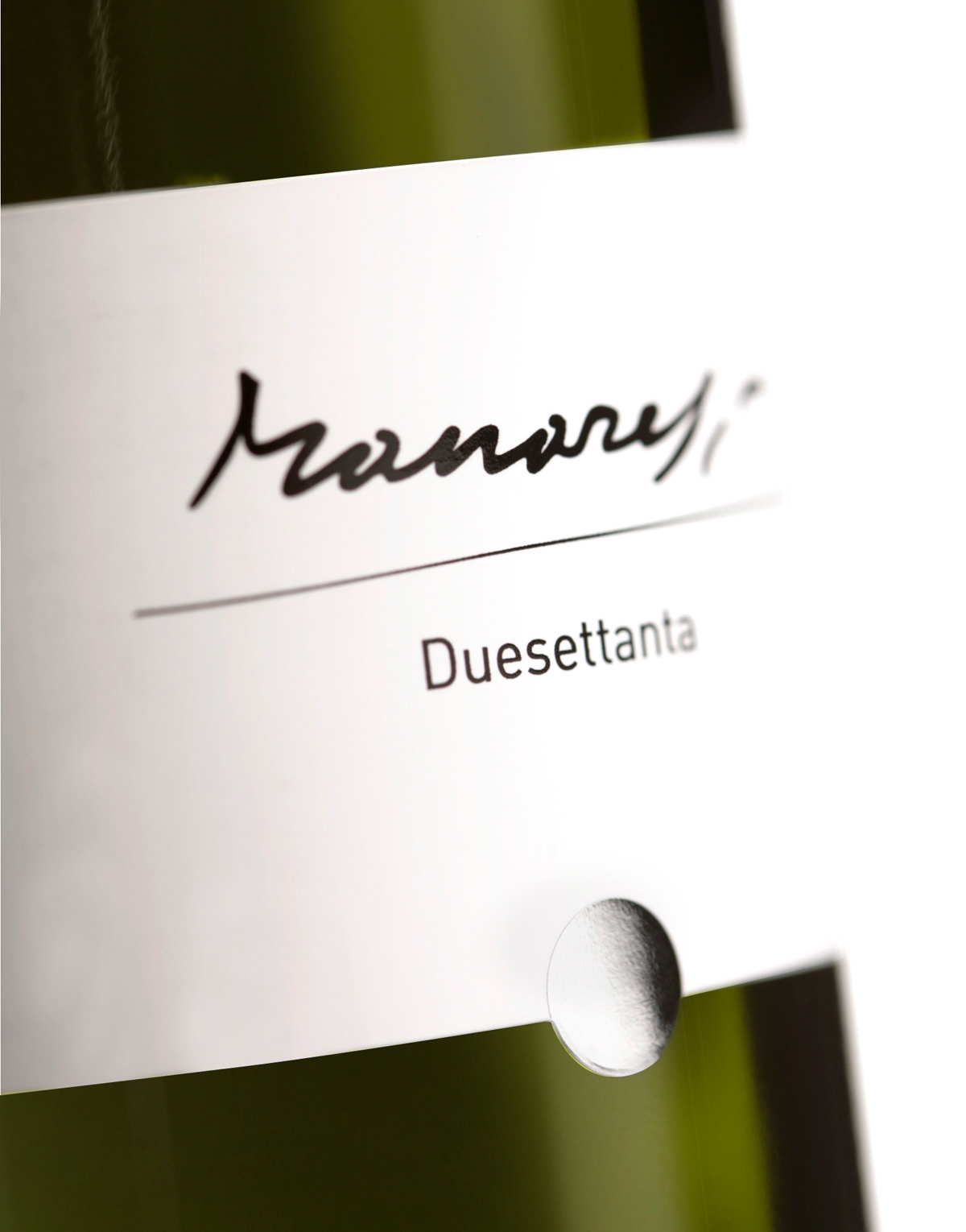
LABELS
The winery flagship wine has the golden dot matched by a golden capsule.
CATALOG
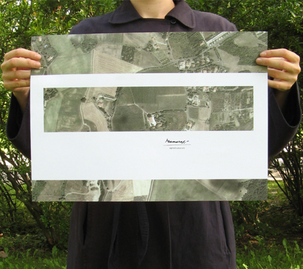
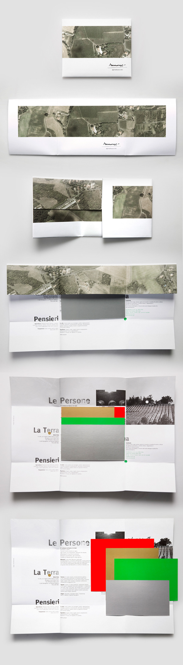
A folded poster containing 4 postcards.
Here the frame contains a top view image of the winery hill, 270 degrees cultivated ground with various grapevines. Once opened the catalog, 4 shiny colored rectangles sit in the middle in their different formats.
On their back they give technical information about the wine, while the inside of the poster contains both technical and descriptive text about the winery.
Poster - 46.5 x 33 cm / Postcards - 18x15, 15x15, 18x12, 18x10 cm
STATIONERY
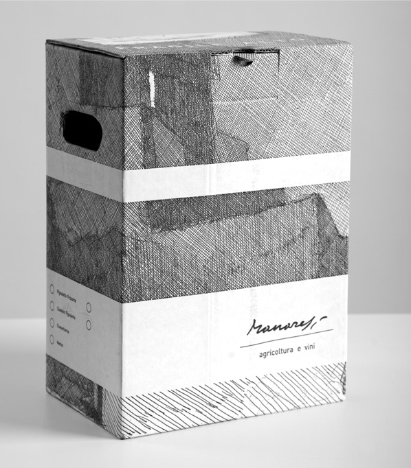
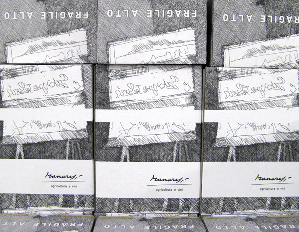
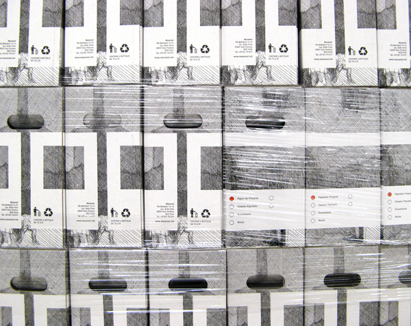
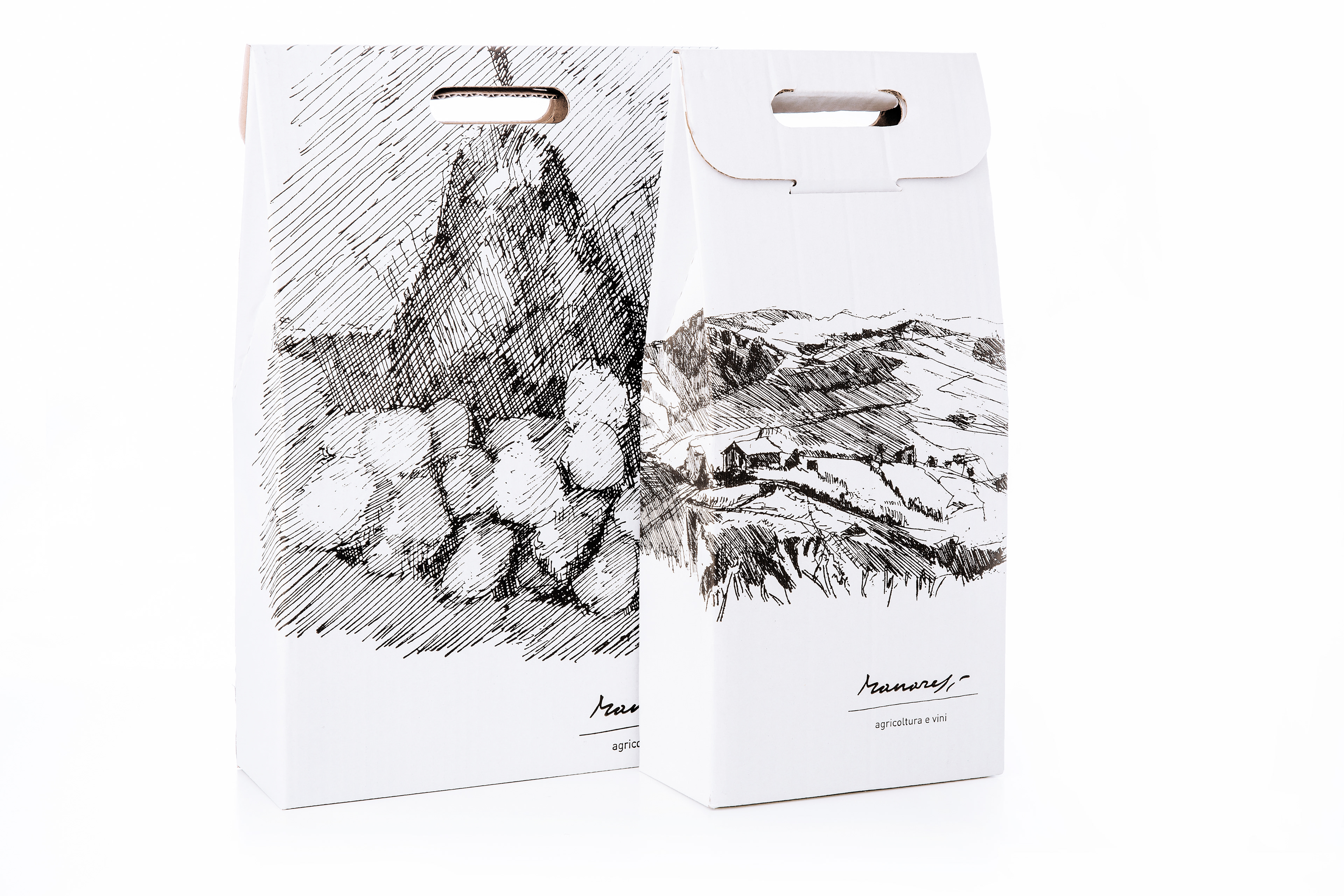
PACKAGING
Simply on color printed with the etchings of Paolo Manaresi.